Selected work

Strategy becomes real when it is executed well.

A growing collection of branding, social media and digital marketing work—presented honestly, with real context and without inflated claims.

BrandingSocial MediaMeta Ads

Dhaboo / Bajrang Food Tech

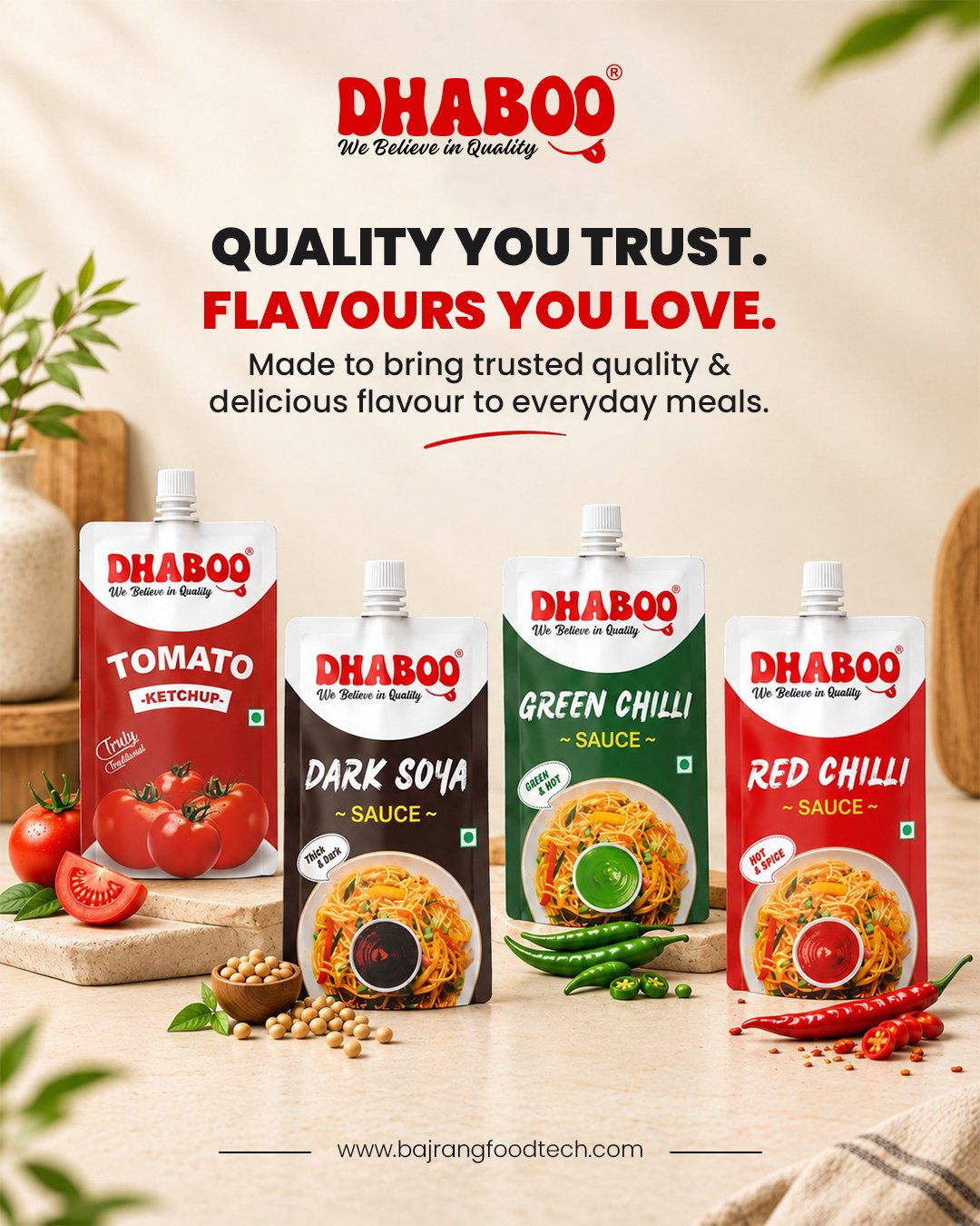
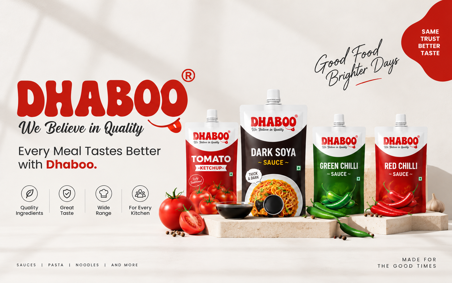
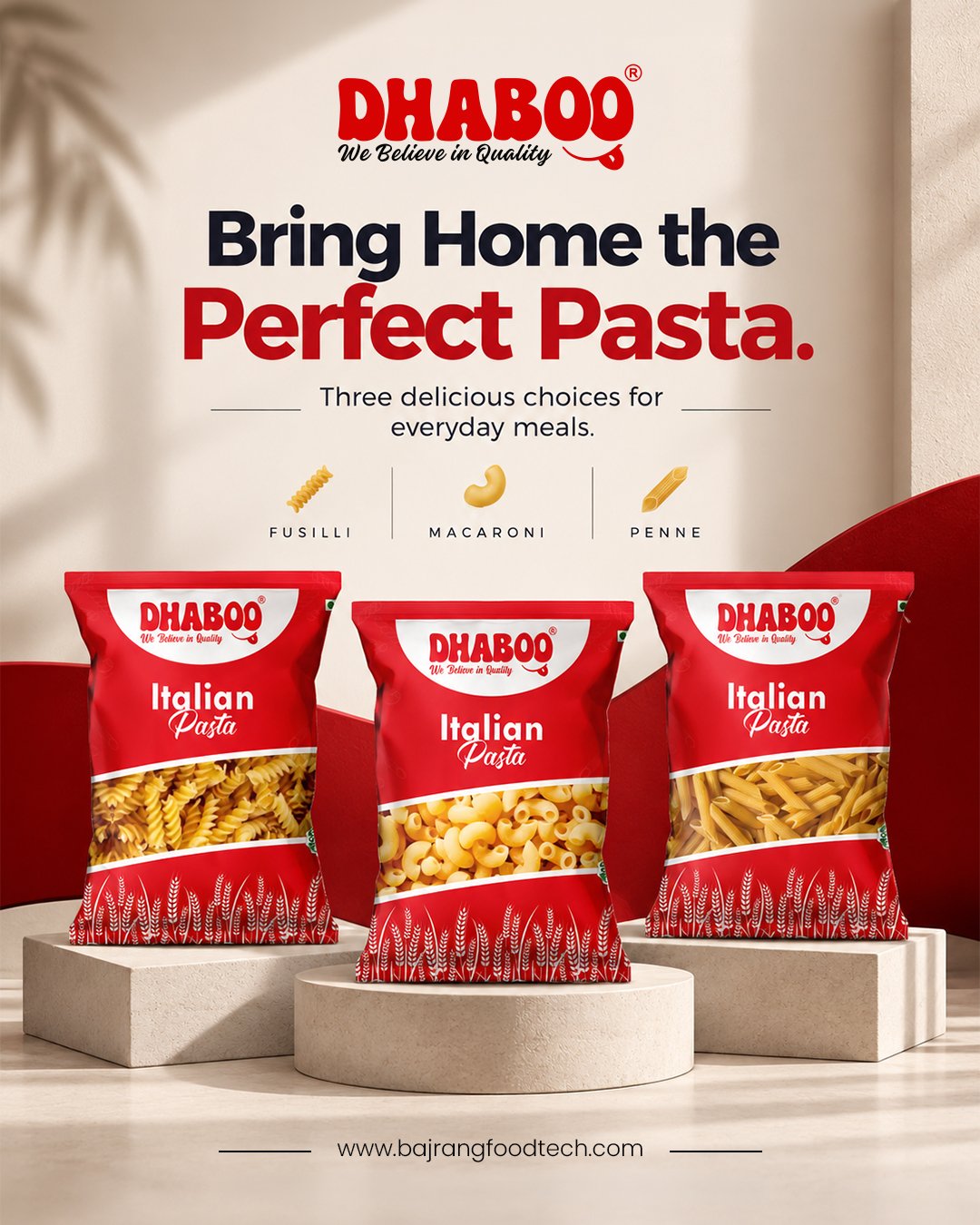
Dhaboo is a food brand from Bajrang Food Tech. Zenoc began supporting the brand with product-led visual communication, social media management and ongoing digital marketing to build a clearer online presence.

Current status

This is an ongoing project. Instead of showing made-up performance numbers, this case study focuses on the problem, the creative direction and the marketing foundation now being built for the brand.
The challenge

The brand had limited social media presence and some earlier posts lacked consistency and polish. Products were not being presented with a clear visual system, making it harder to build trust and recognition online.

What Zenoc is doing

  • Using the existing Dhaboo identity to create more premium, product-led creatives.
  • Making the sauces, ketchup and pasta range more visible through social media communication.
  • Managing content direction and building a more consistent online brand presentation.
  • Supporting the brand with Meta Ads and ongoing marketing activity.

What this work is designed to improve

A stronger and more recognizable digital presence, clearer product visibility and a better foundation for future awareness, engagement and sales activity.
Brand IdentityLogo SystemCreative Direction

Zenoc Digital Brand Identity

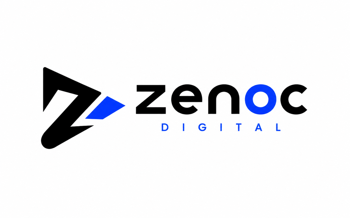
Zenoc needed an identity that felt modern, bold and digital-first—something sharp enough for creative work, structured enough for strategy and flexible enough for website, social media and future campaign use.

Identity intention

Create a brand mark that communicates speed, clarity and forward movement while staying clean and usable across dark and light environments.

Primary markHorizontal logo lockup
Zenoc Digital horizontal logo
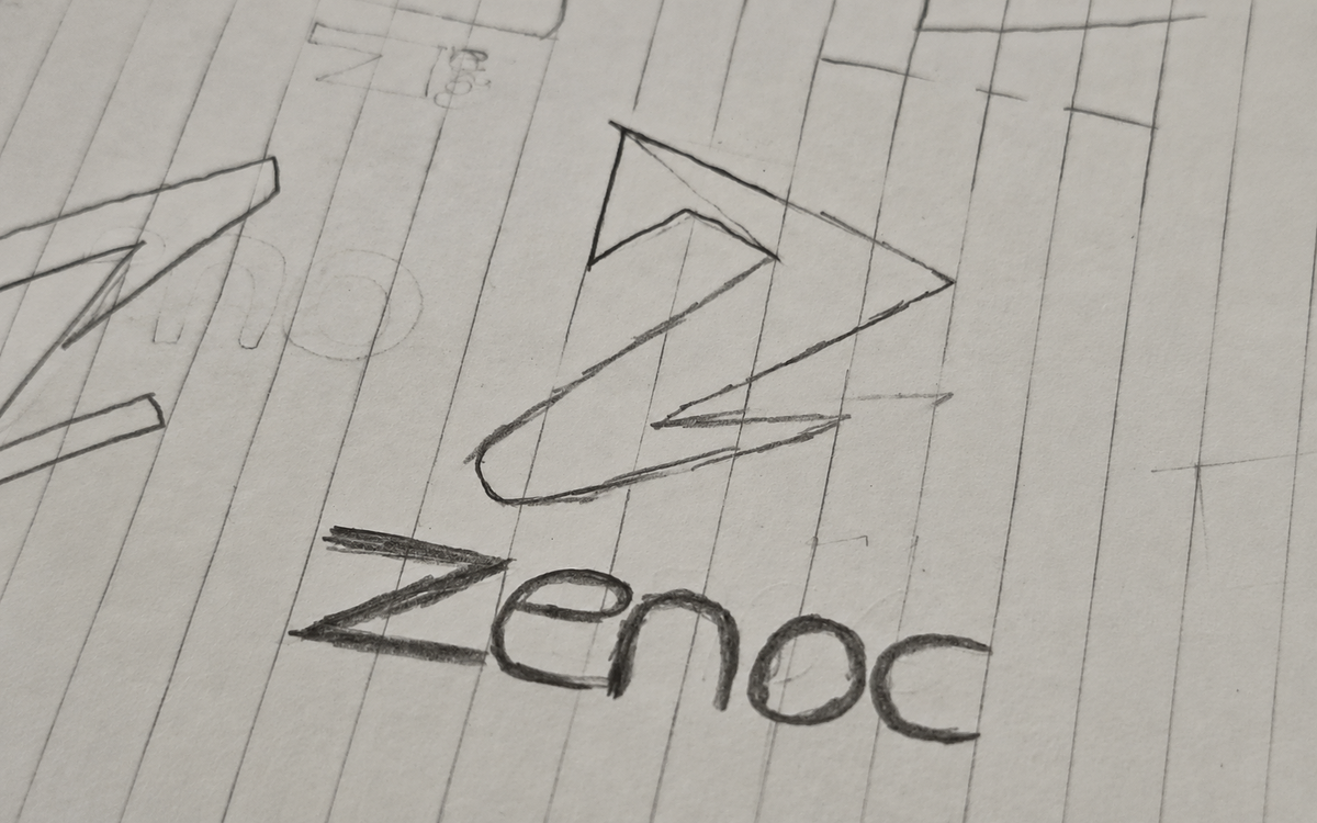
Concept explorationEarly direction & symbol thinking
Zenoc Digital early logo sketch

The idea

The identity is built around a custom Z icon paired with a clean wordmark. The angular form suggests movement and direction, while the blue accent adds a digital, energetic edge without losing clarity.

System design

  • A primary horizontal logo for website headers, presentations and wide-format layouts.
  • A stacked logo lockup for square formats and profile-style placements.
  • A simplified icon mark for favicons, hero visuals, social avatars and compact branding.
  • A black, white and electric blue palette to keep the identity premium, sharp and highly usable.

Where it works

The brand system is designed to scale across website UI, motion graphics, social media creatives, pitch decks and future campaign assets while keeping recognition consistent.

Have a project in mind?

Let’s turn your next marketing challenge into work worth showing.

Tell us what you want to improve—brand clarity, social media, performance marketing, SEO or your website—and we’ll recommend the most useful next step.

Start a project ↗